

When the footage arrived for this slick Nike product superiority film, we were totally in awe of how dramatically beautiful it looked. Dream rushes for an editor!
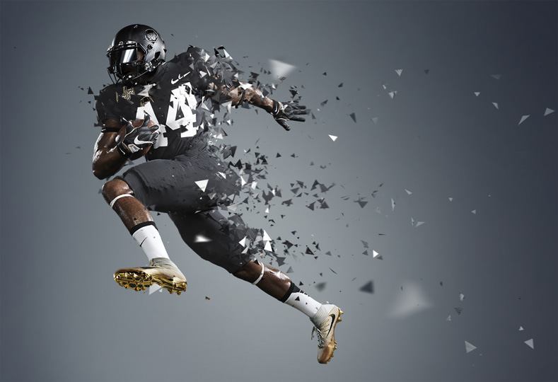
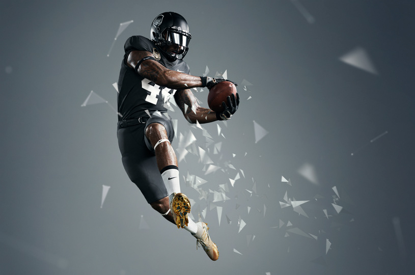
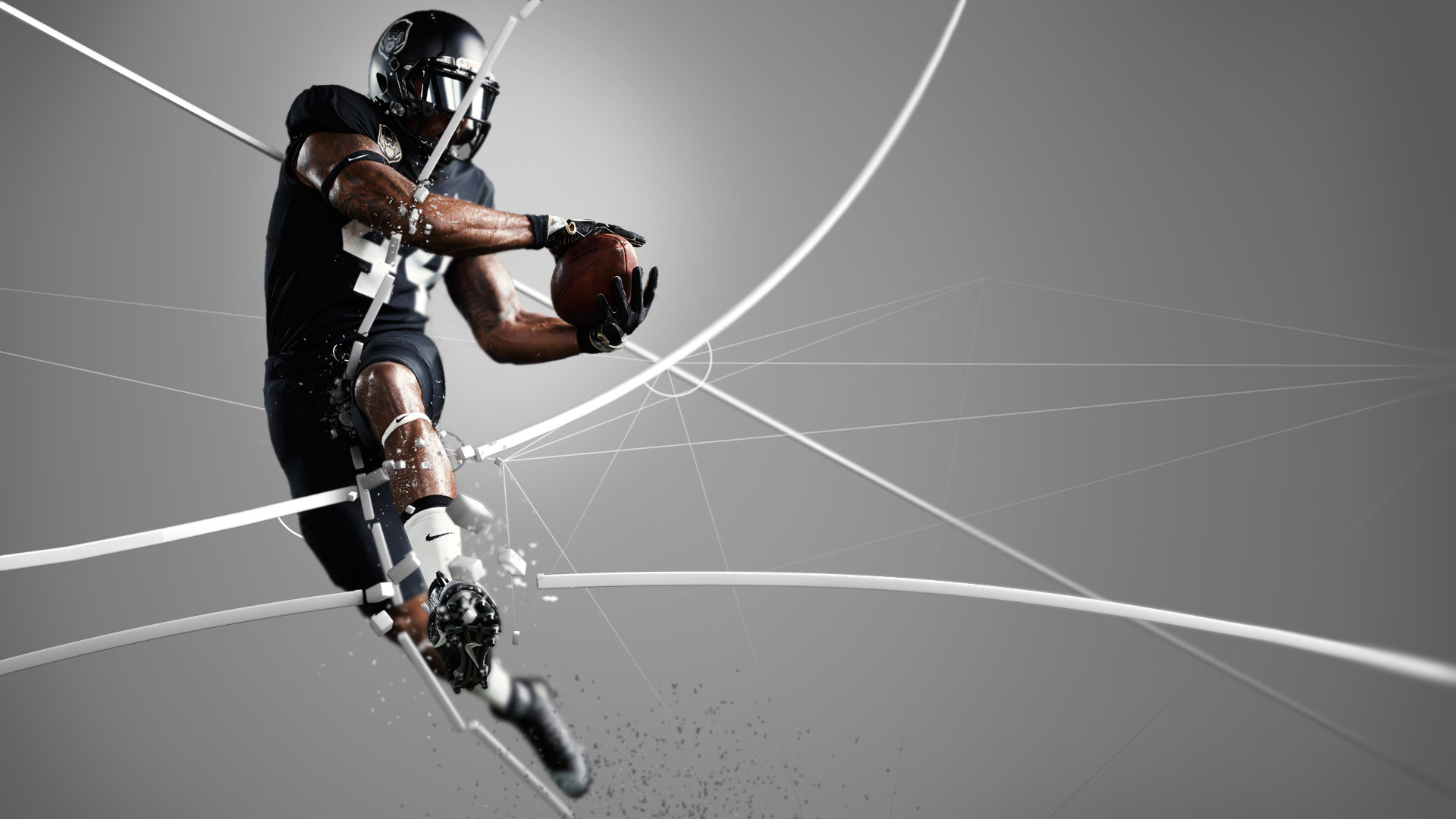
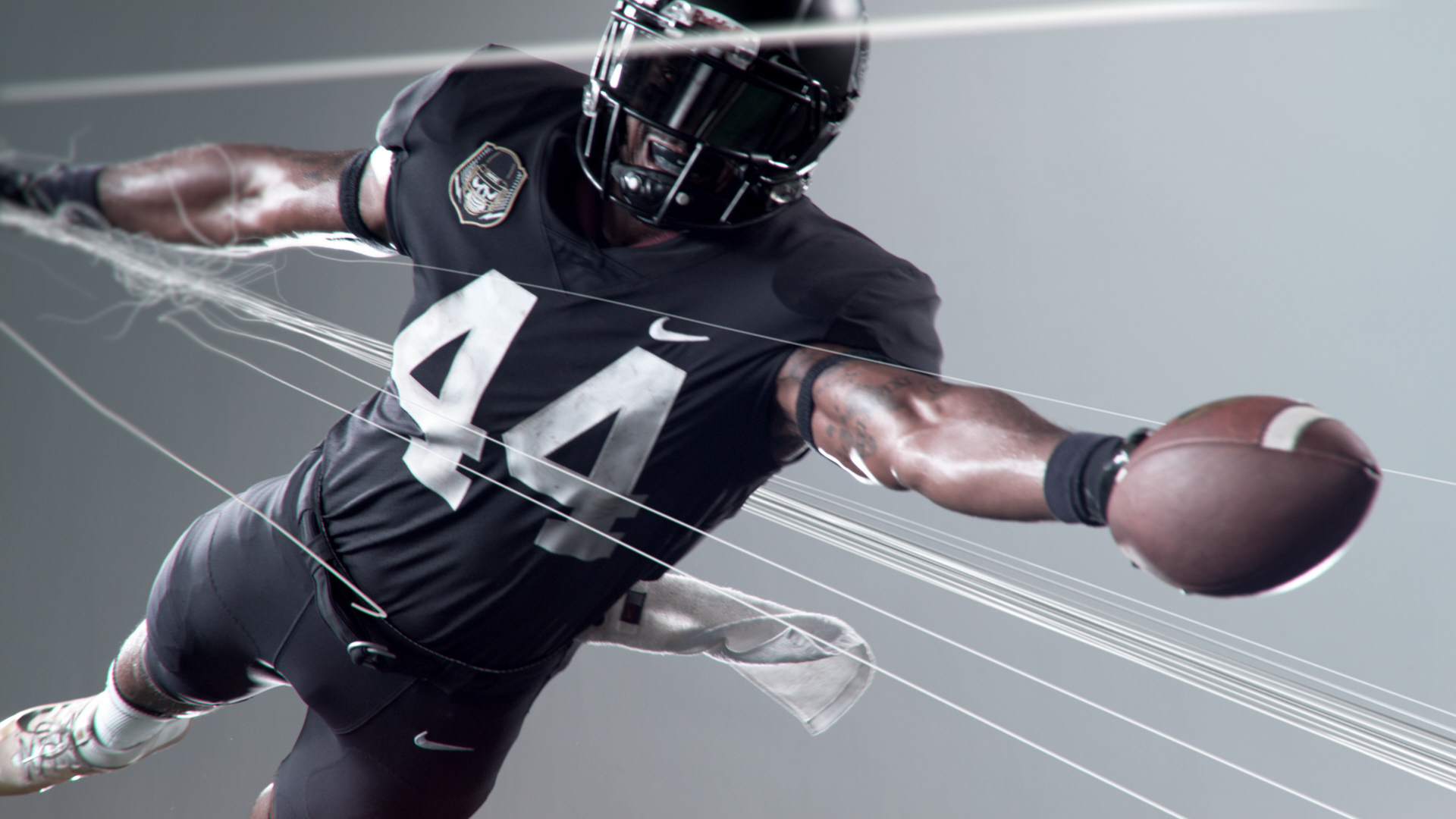
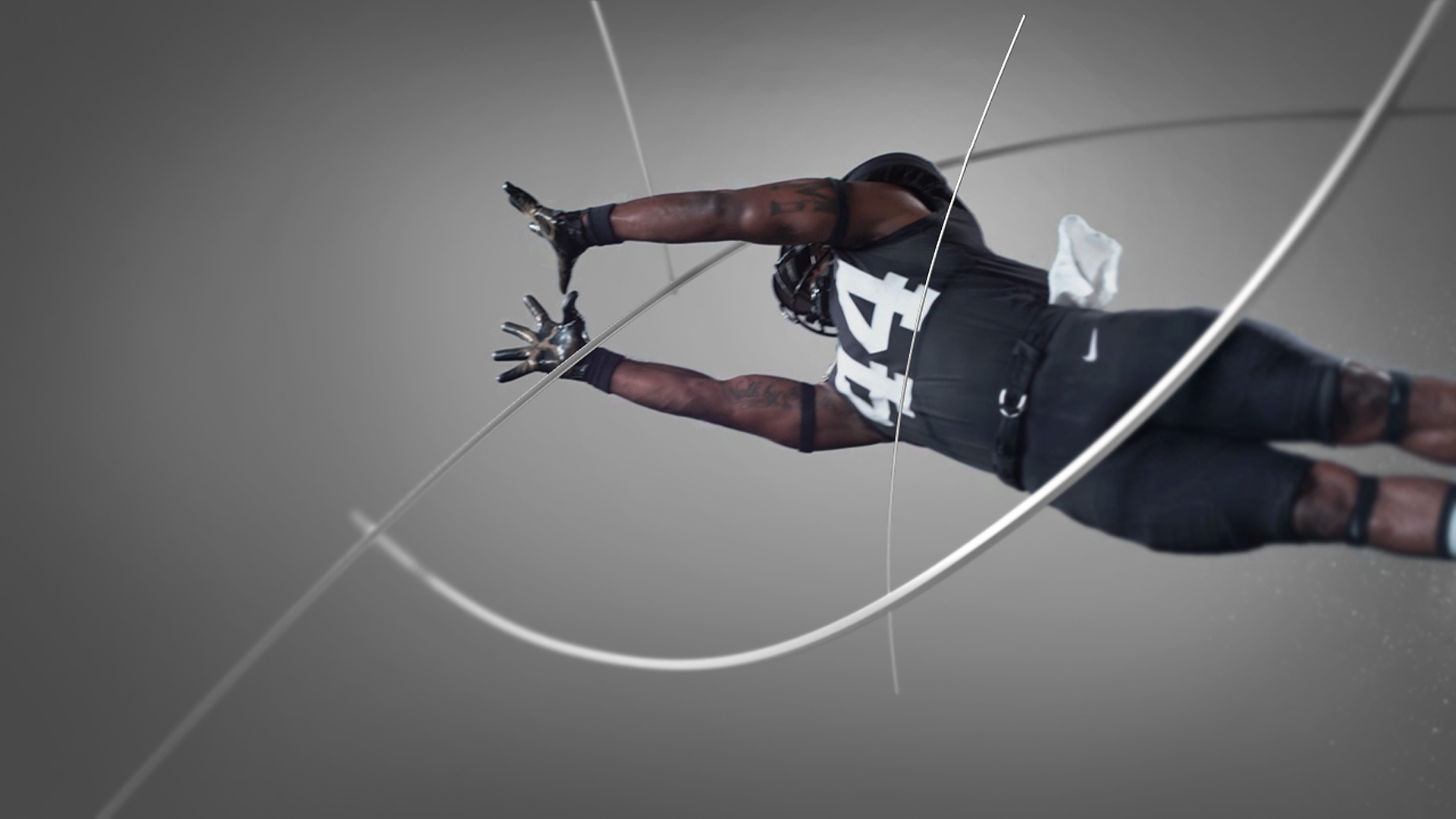
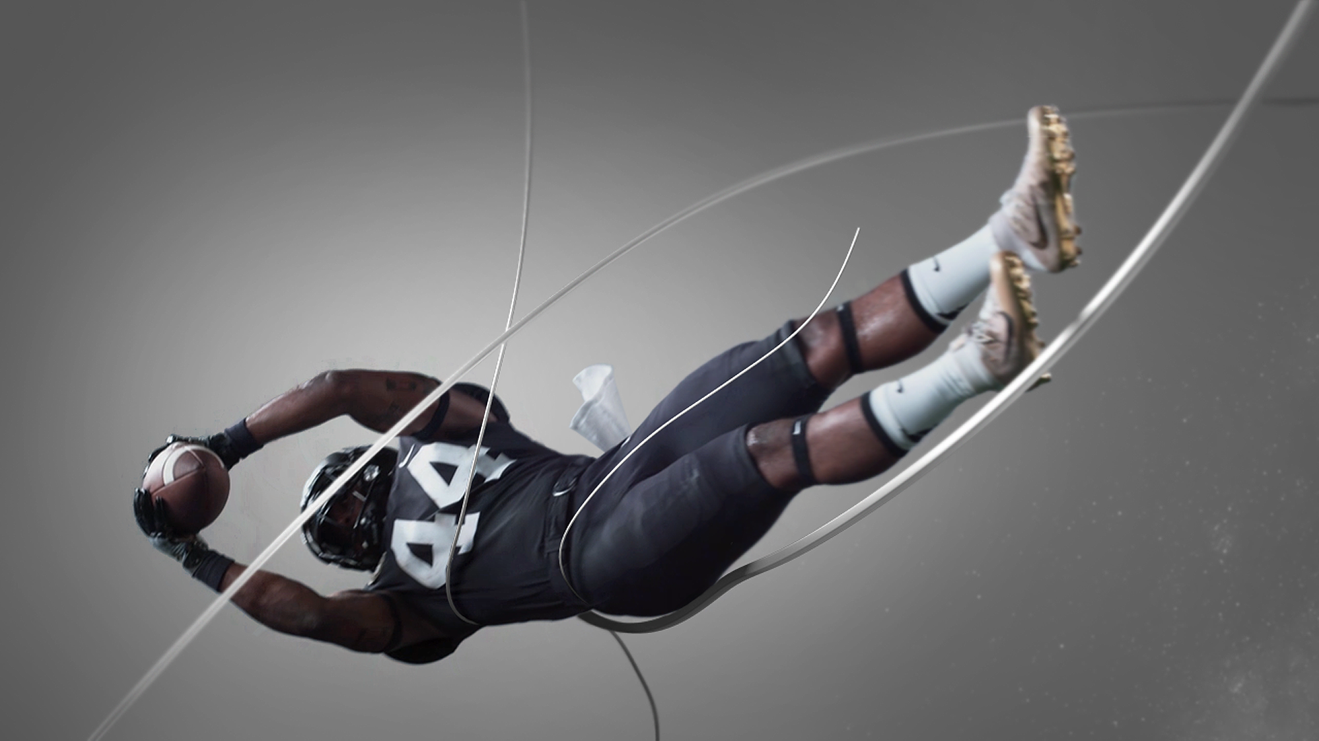
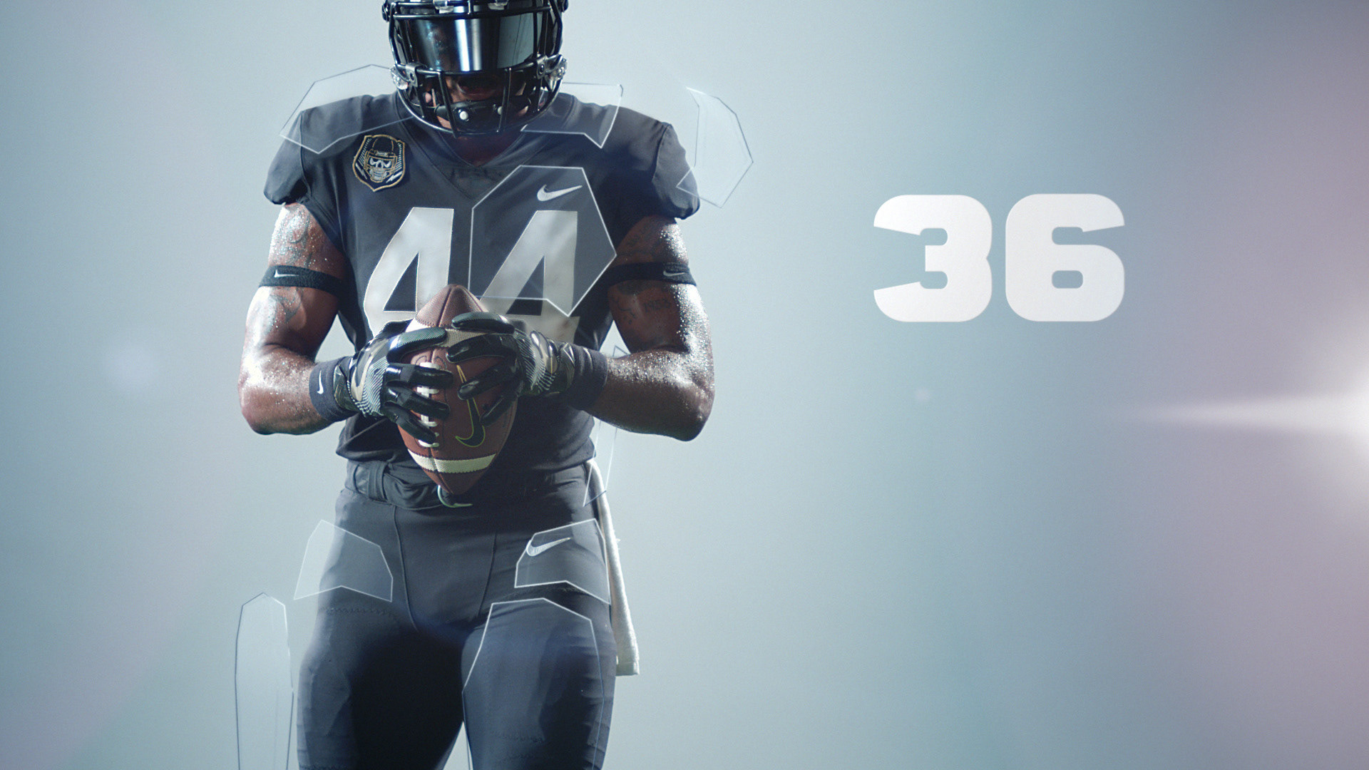
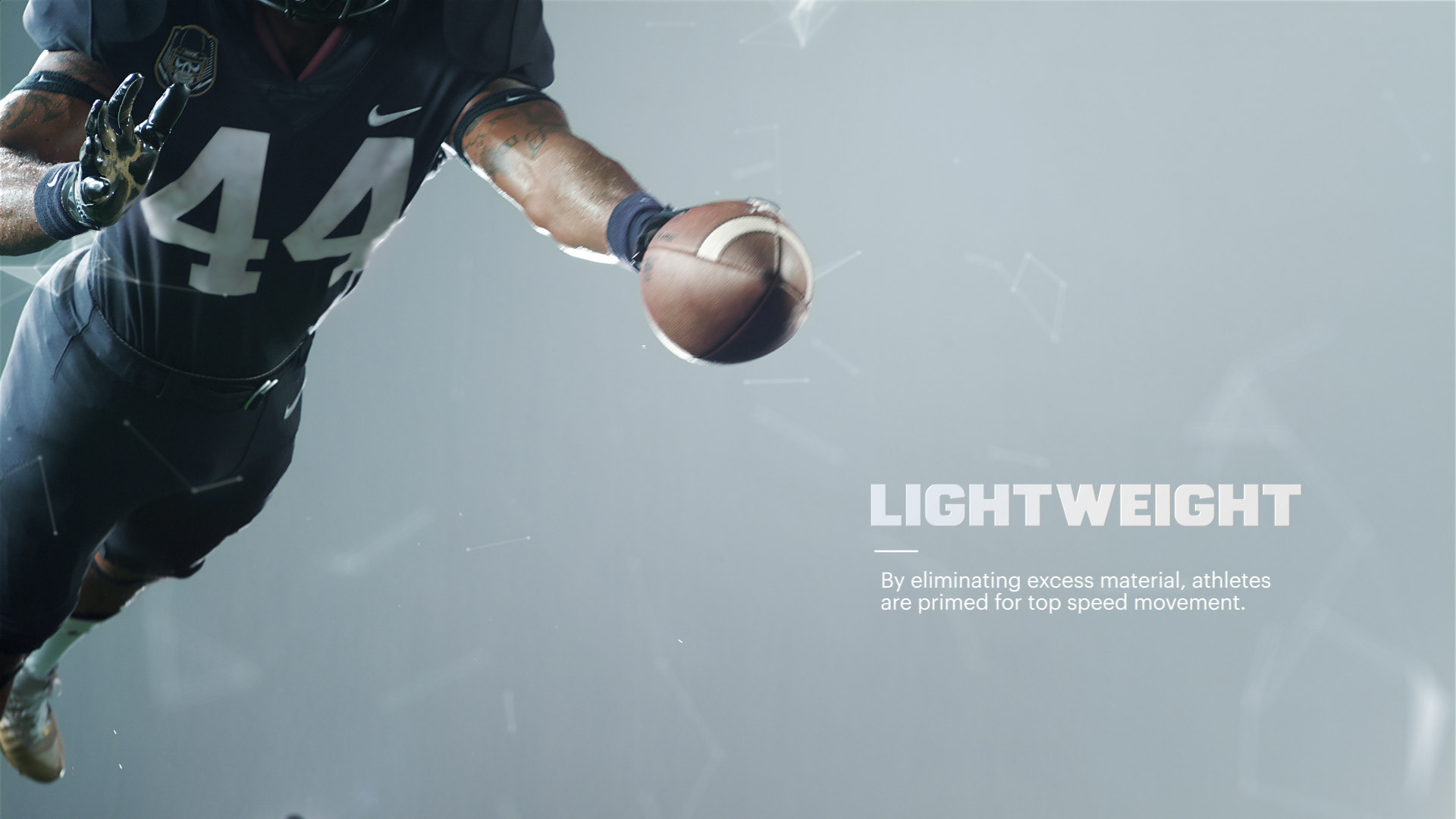
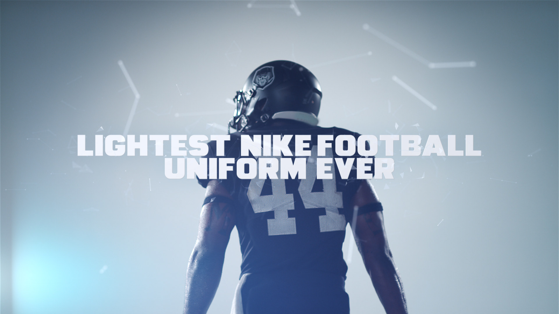
This brand film is meant to inspire the viewer to believe in the epic power of Nike's revolutionary jersey. The opportunity to create a smart, snappy edit with cool graphics to elevate the visual experience was one we couldn't pass up. Plus, Nike is always such an open-minded, inspiring group of people to collaborate with. In the first iteration of designs, we experimented with communicating the idea of lightness and increased range of motion by depicting the athlete breaking through suspended geometric elements. Eventually, this approach was simplified and streamlined down to an edit-driven piece with minimal line-art style graphics. We also developed designs for print.
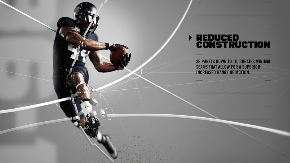
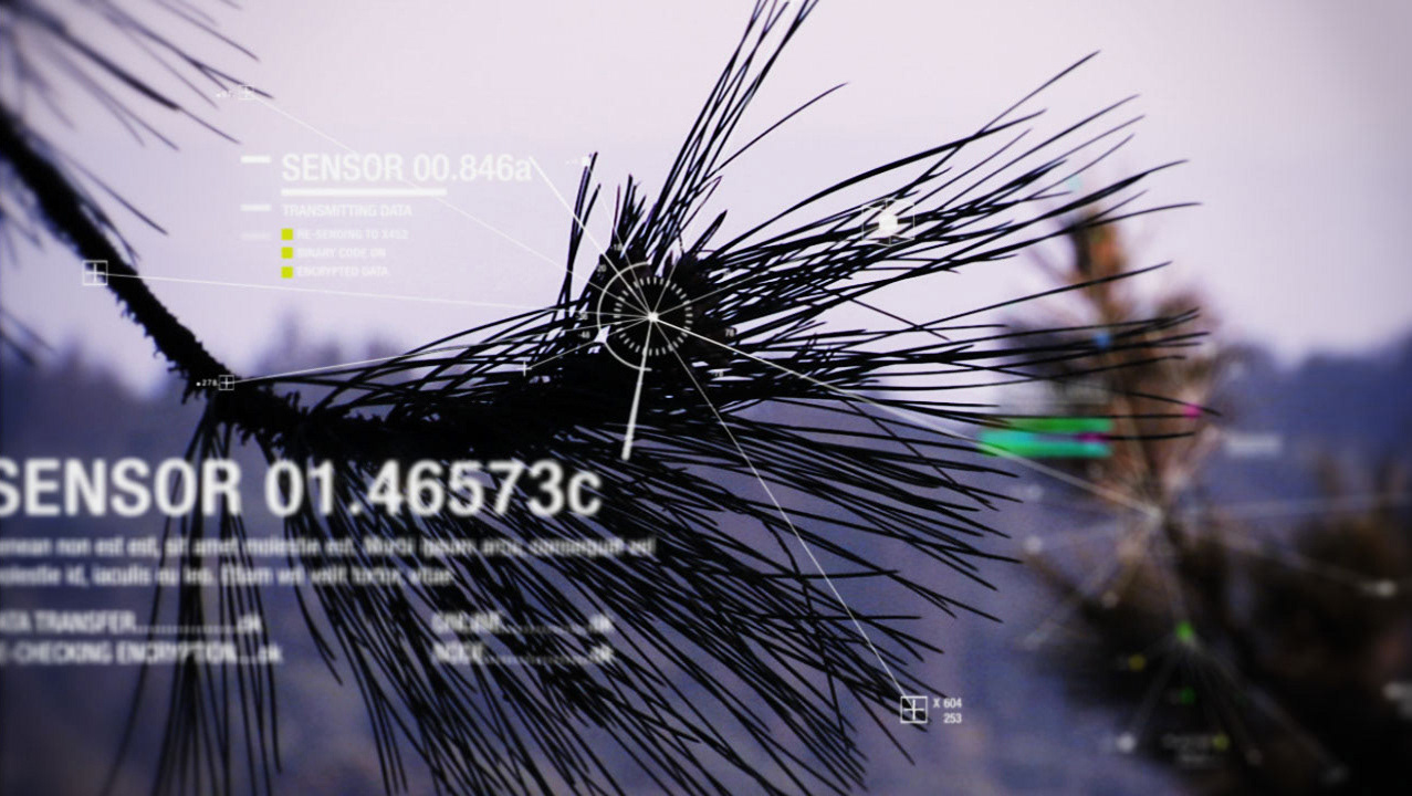
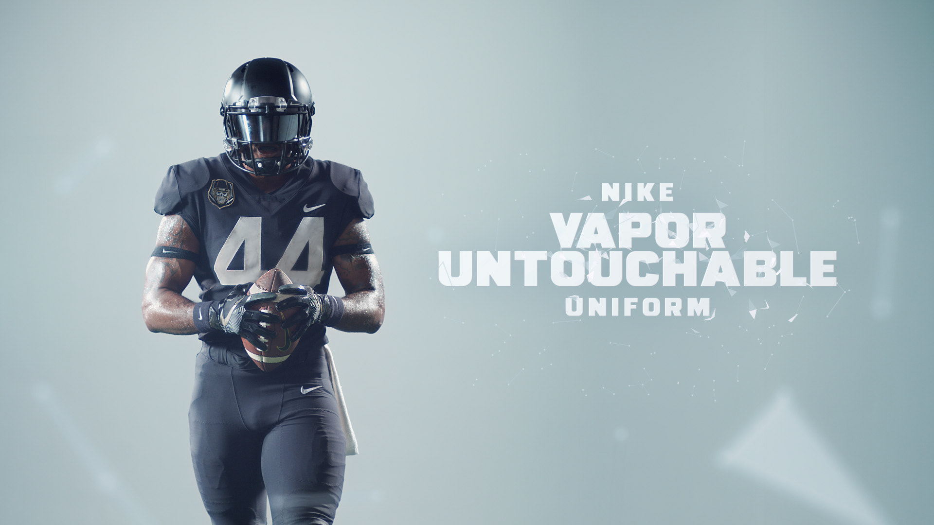
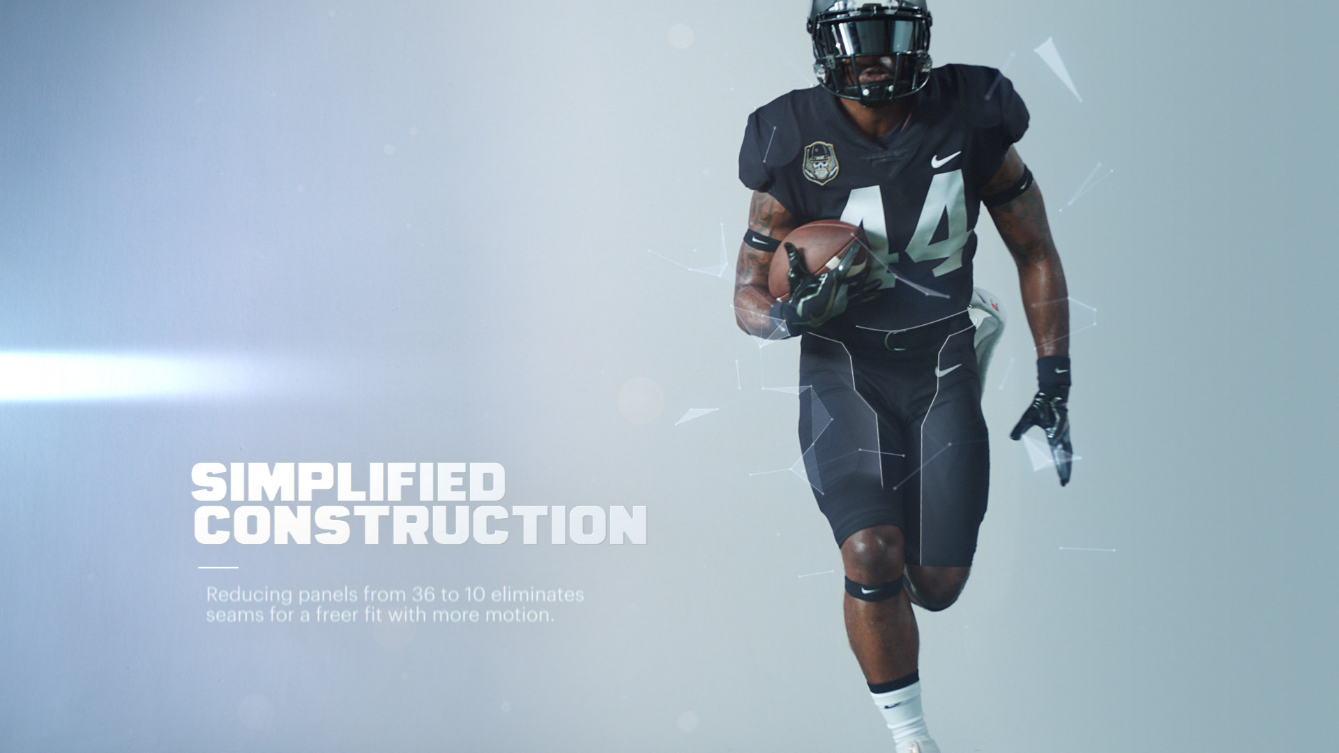
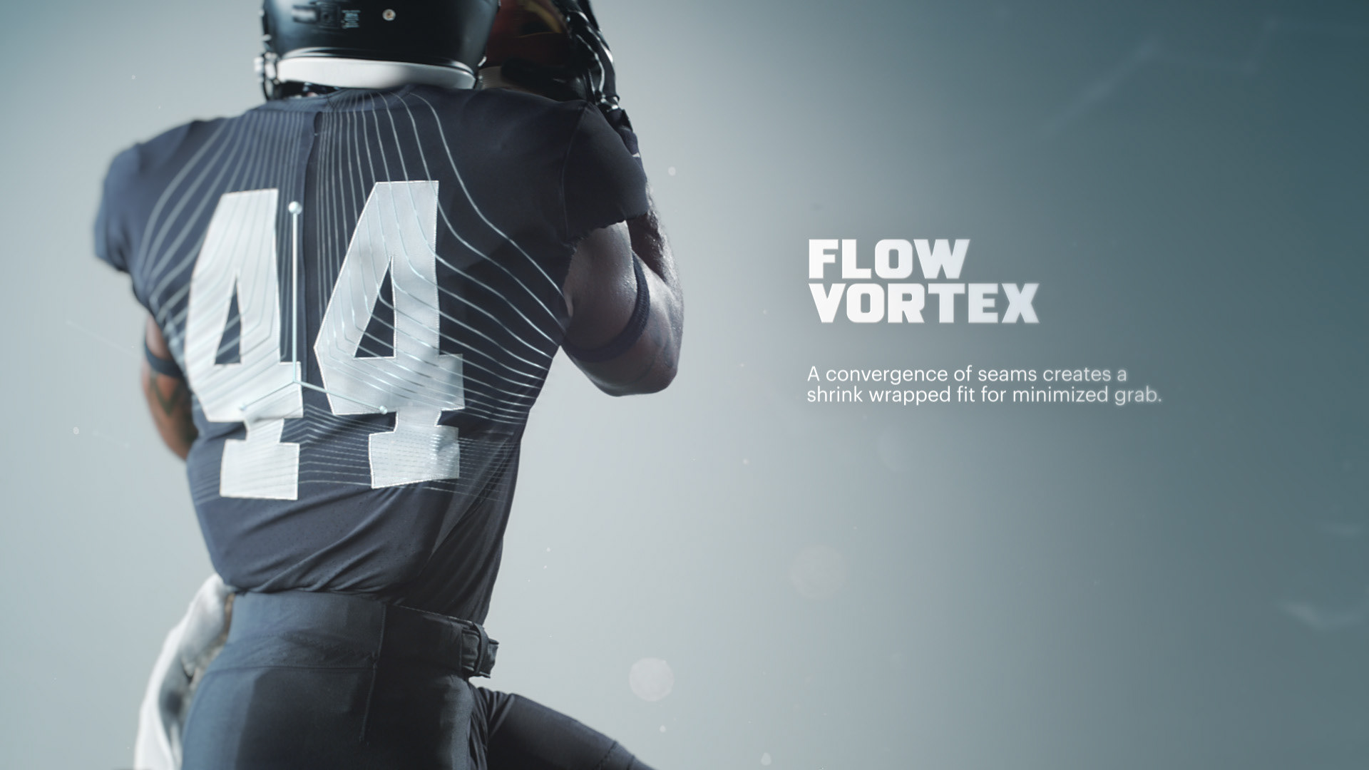
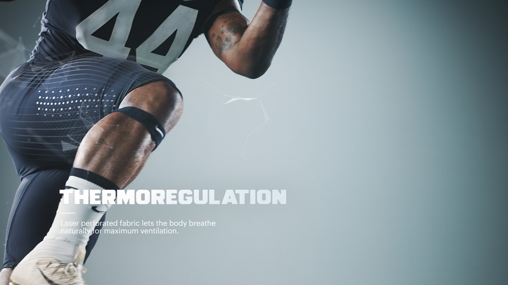
The main creative challenge on the design side of things was to find simple graphic ways to communicate each of the key product benefits (the supers explain what each of those benefits are).
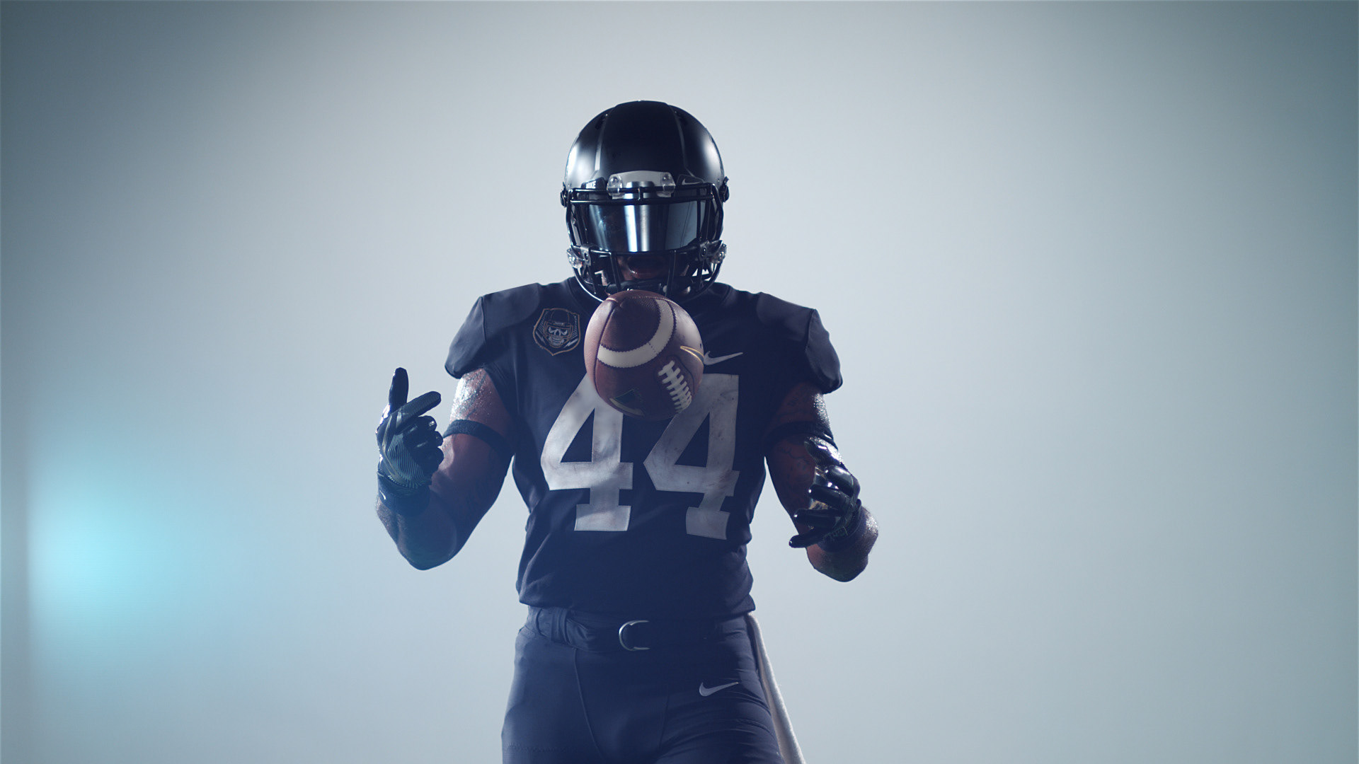
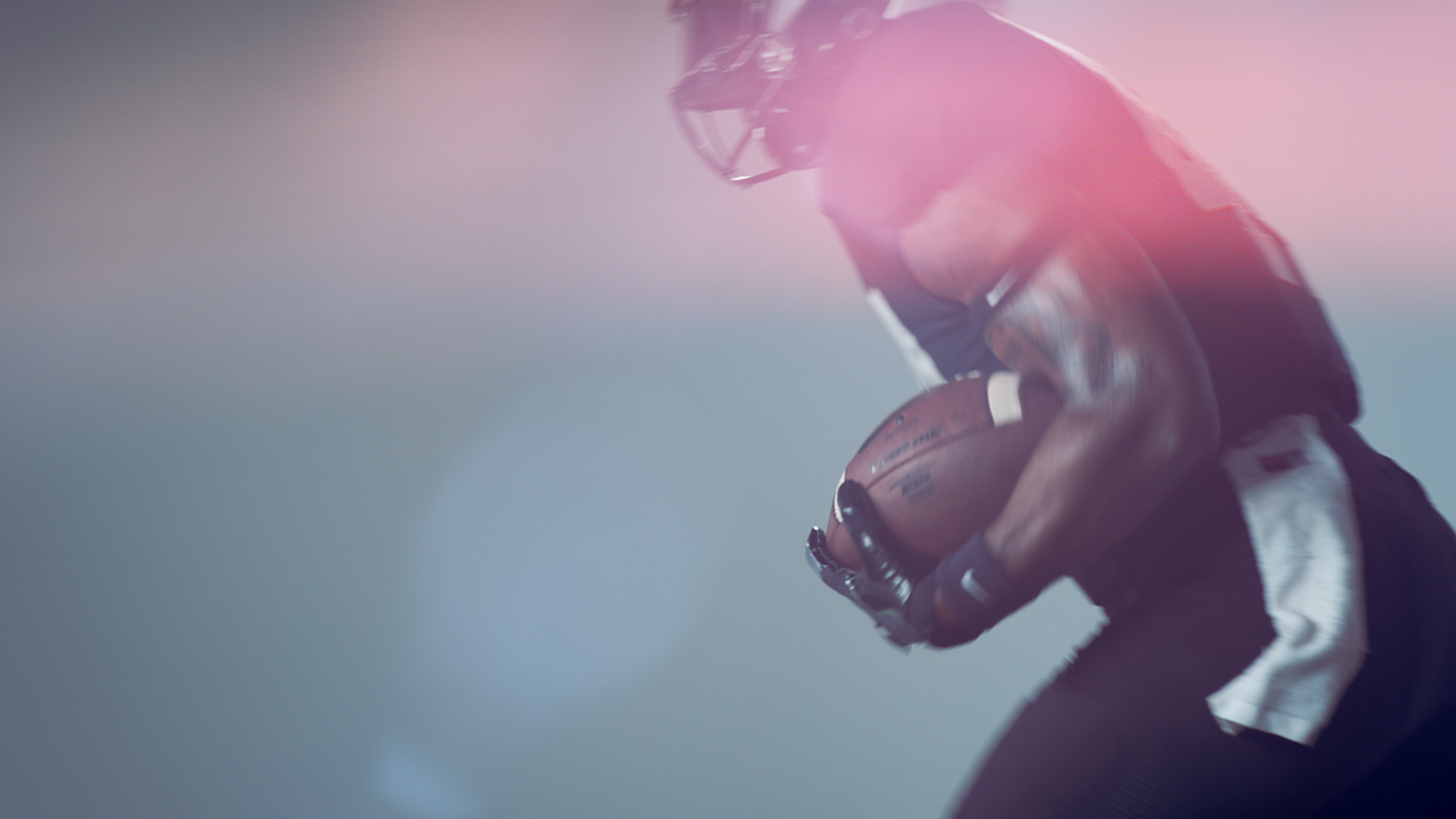
Our beloved editor, Steve Manz, used the editing opportunity to slow down, speed ramp, and cleverly cut the footage into something really beautiful and eye-catching that simultaneously showcases the graphics and product benefits.
The timeline was extremely efficient and tight but we all rose to the challenge. We had about a week to nail down the look of the graphic treatment and the edit (!), and from there we hit the ground running with animating the various elements. Featured here is our Director's Cut of the brand film for your viewing pleasure. Make sure to also go to this link to check out a before and after look at the VFX! https://vimeo.com/153933073
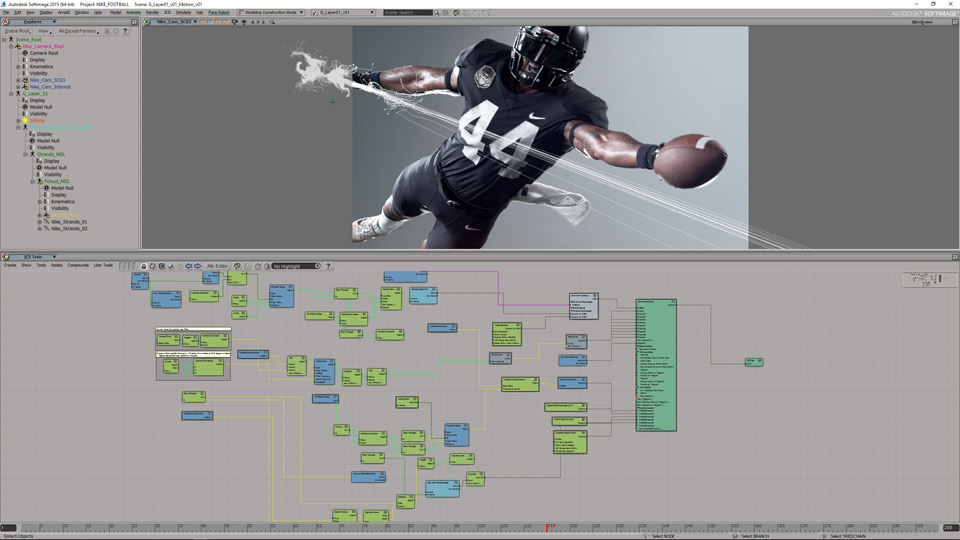
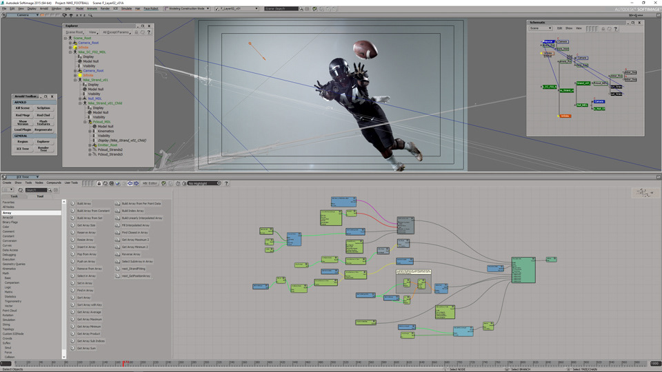
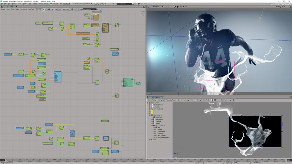
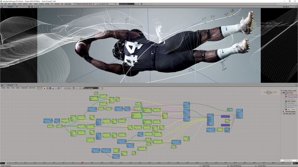
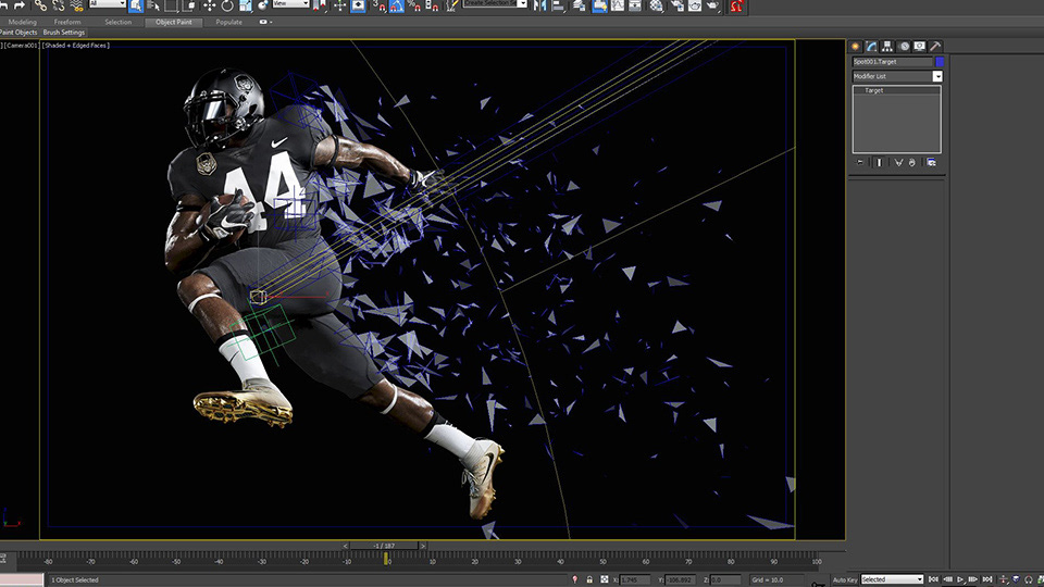
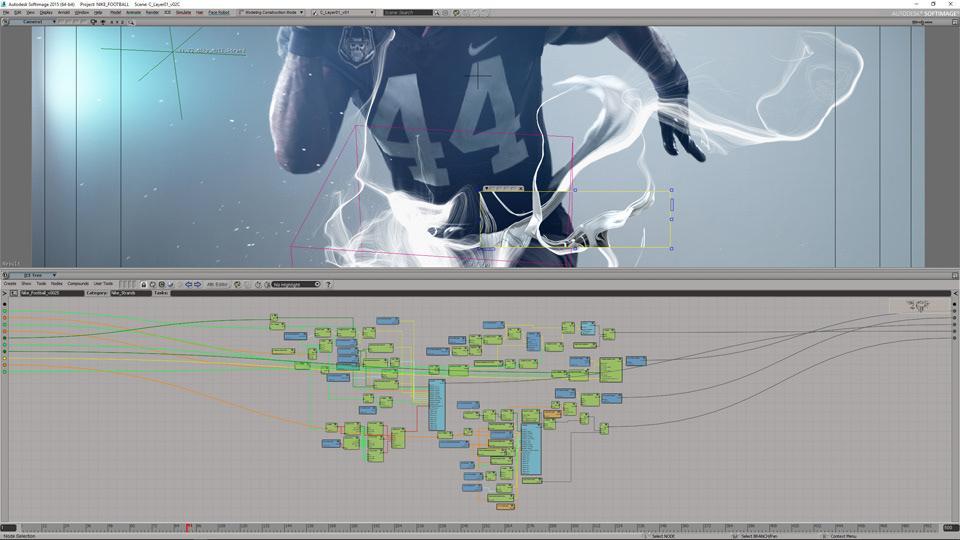
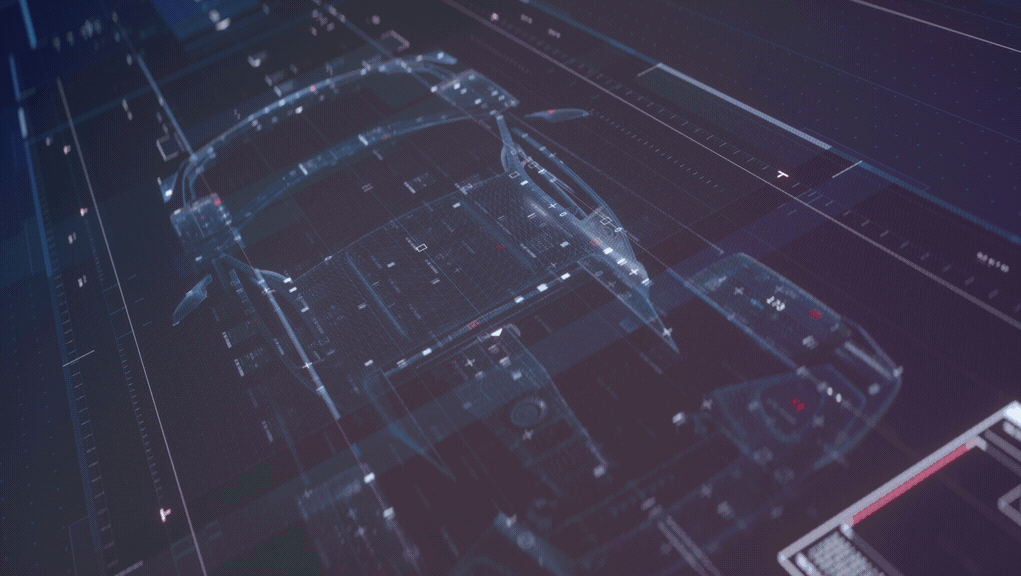
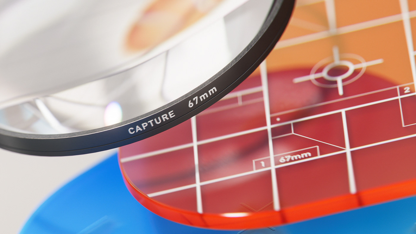
STYLEFRAMES AND WIREFRAMES: