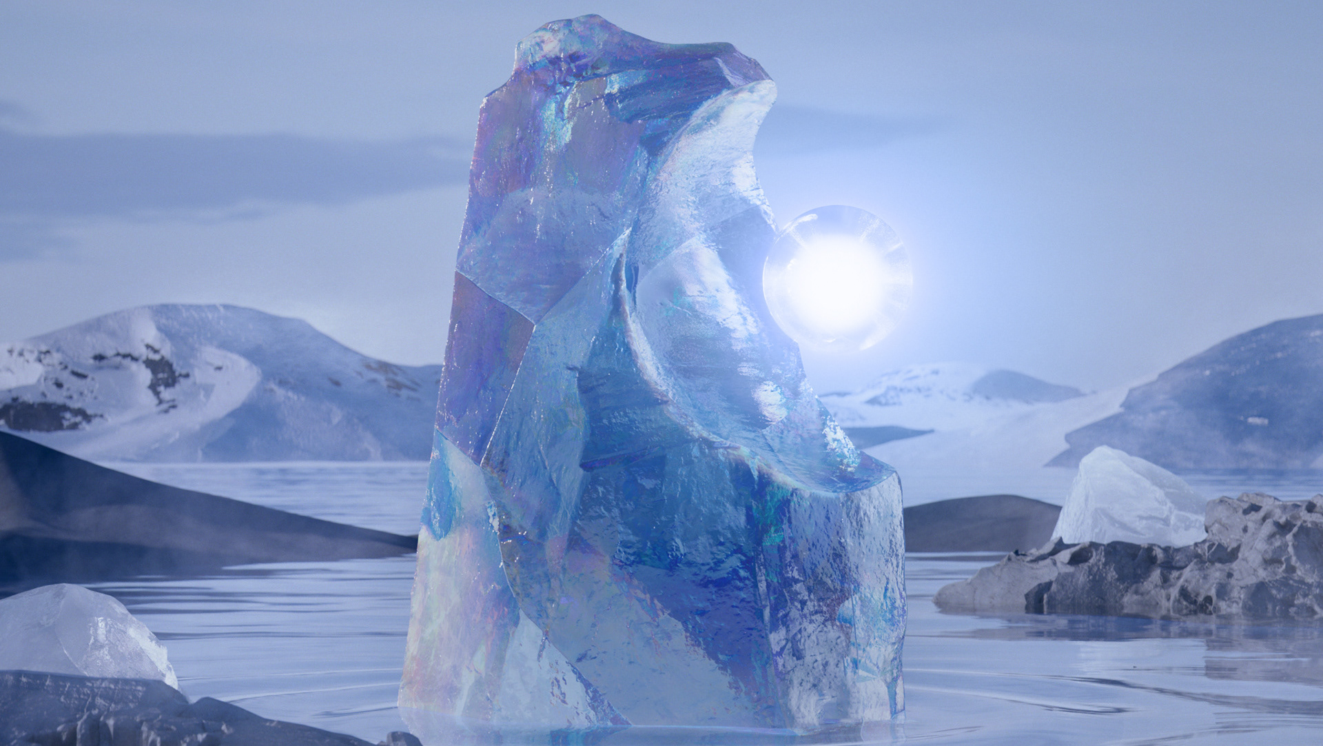
We instantly fell in love with the sleek, timeless brief that came to us via Passion Pictures for Audemars-Piguet's Royal Oak 'Perpetual Calendar' brand video. It called for us to find a way to visually present the connection of the Royal Oak timepiece to the very particular place of its origin (Vallée de Joux, Switzerland) as well as to the Cosmos and the Moon.
AP's watches have an air of romance and depth of craft that is difficult to adequately convey. A perpetual calendar is a watch that through complex mechanical design is able to track the time of day, date, the phases of the moon, month and week factoring in leap years and only needs to be adjusted once in a century. Gear upon gear upon tiny spring, a perpetual calendar is able to mimic the motions and geometry of the cosmos all in the name of tracking our human concept of time. Pretty incredible!
Production and post-production met a number of obstacles and stories to laugh about back home. We shot in the actual Vallée de Joux, a harsh and inhospitable yet mythically beautiful place. We went out with the intention to capture the full moon... which due to rain never showed her face. Wind made shooting with our drone nearly impossible at times. But believe us–we had a blast! Our jovial drone DPs Henning and Mathias helped to make the tricky shoot extra fun.
From Fondue and Rosti on the mountaintop, to varnish-like booze made from flowers that our guide Christophe brought out to keep us warm, it was one adventure after another. On our early morning shoots, there were herds of reindeer that would scatter as we arrived. Our beloved editor Jackie even spent one night editing in an ancient stone barn!
Back from the wilderness and at the AP factory, shooting the watch in macro was a whole other challenge. To get that close means every tiny grain of dust and every scratch is magnified to grotesque proportions.
Creatively, the test was to establish a graphic and visual language that felt right. It had to be neither overly technical, nor quaint or antique. It was also a constant challenge during the edit to find the right balance of sexy product, landscape and graphics and make things feel fluid and cohesive. We paid a lot of attention to transitions between scenes and moments.
All the work and love that went into this film reflect the utmost craftsmanship of the product itself. We'd be lying if we said this project was a piece of cake–but we loved the journey as much as we are proud of the outcome! Featured here for your enjoyment is our director's cut of the film.
PROCESS MATERIALS


